Projects > Case study
Girlfriend

The brand is inclusive, but breaks that promise at checkout
OVERVIEW
THE BUSINESS PROBLEM
The eCommerce presents critical gaps:
hidden information
discounts not visible, out-of-stock items not flaggedmissing standard features
wishlist, live chat, sort bycheckout friction
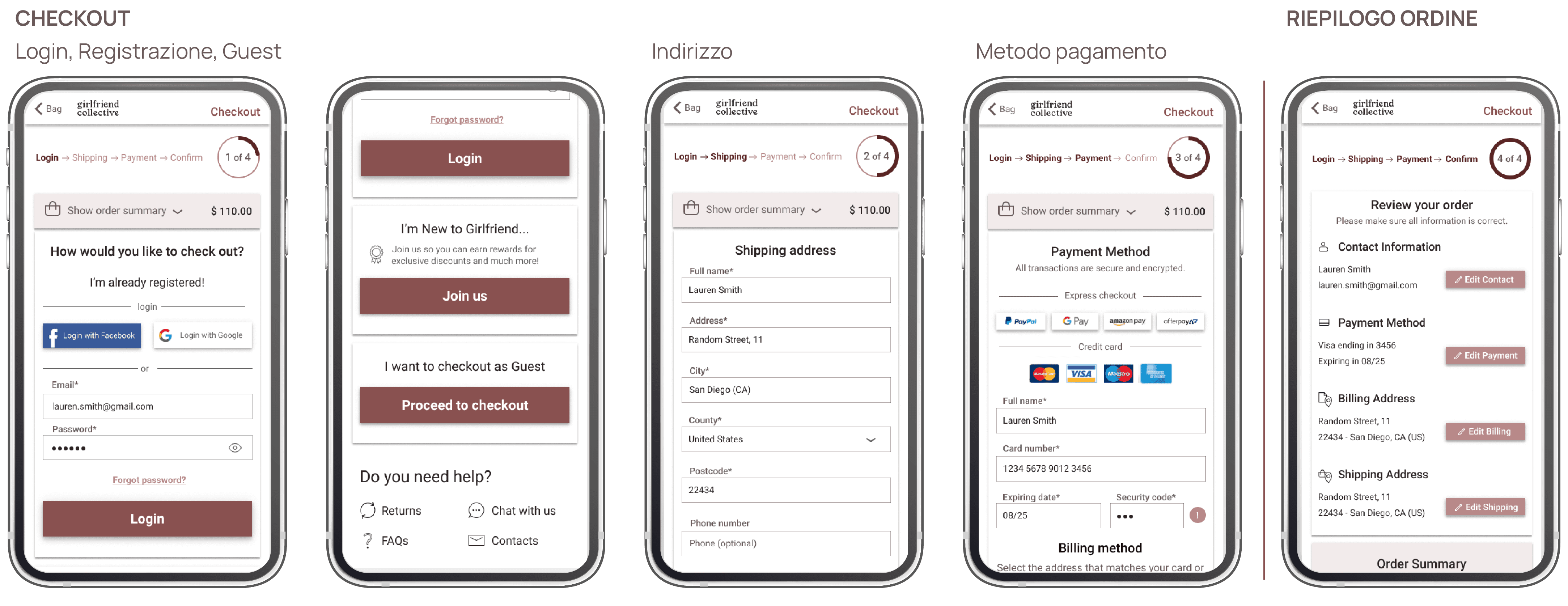
mandatory registration, no social login
Perceived misalignment: the brand declares inclusivity but the UX presents usability barriers.
OPPORTUNITY
Reduce pain points in the purchase flow and align with best practices by:
improving product findability
providing decision making support
simplifying checkout
SOLUTION
The design process
Direct-to-consumer e-commerce with a clear positioning:
Slow fashion
Limited production
Inclusivity
Sizes for every bodyTransparency
Documented supply chainEnvironmental commitment
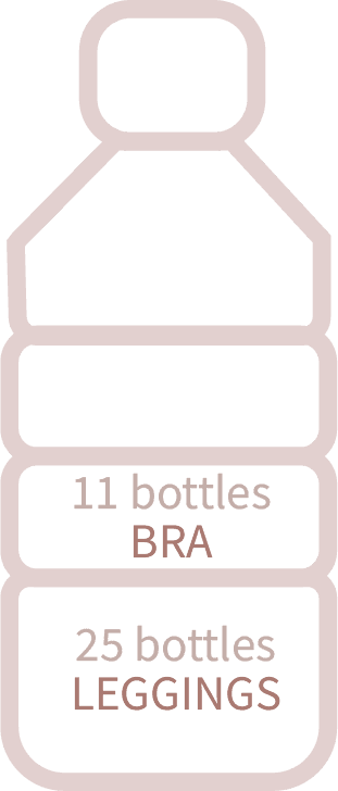
Recycled materials and eco-friendly dyeing
The launch, WOW and WOM factor
The brand chose a Facebook Ads "share the website with a friend to receive a free pair of leggings".
Result: 10.000 orders in 24h and stock immediately sold out.
There is a contradiction
The brand launches and goes viral with a campaign that removes barriers and builds trust
yet the checkout
is not user-friendly due to the mandatory registration and no social login, not even Facebook.
10 HEURISTICS TO IDENTIFY USABILITY ISSUES
5 heuristic violations that hide information needed to decide
Some standards are only partially met, with an impact on the purchase flow and information discovery.
1.
Visibility of system status
Item availability visible only on the detail page
Medium severity
3.
User control and freedom
No wishlist, impossible to save products
Medium severity
6.
Recognition rather than recall
Promotions hidden, no labels or dedicated section.
High severity
7.
Flexibility and efficiency of use
Impossible to sort products by price, popularity or newest.
High severity
10.
Help and documentation
Missing Live Chat,support not immediate via FAQ or email.
Medium severity
COMPETITIVE ANALYSIS
What competitors offer to convert that's missing at Girlfriend?
8 US activewear e-commerce brands producing sustainable activewear, representing direct competitors because:
female audience
products made with recycled materials (plastic derived)
similar price range
eco-friendly dyeing processes
Oeko-Tex certification
ethically made and fair trade / labor
non-profit initiative members
Girlfriend vs competitors
No wishlist
Items cannot be saved.
Only 3/8 competitors have a favourites feature.
Hidden discounts
No labels or dedicated sections.
7/8 competitors display offers.
Impossible to change the results view.
8/8 competitors have this feature.
Size inclusivity
Widest size range.
Only 2/8 competitors come close to Girlfriend's assortment.


USER RESEARCH TO UNDERSTAND PURCHASING HABITS
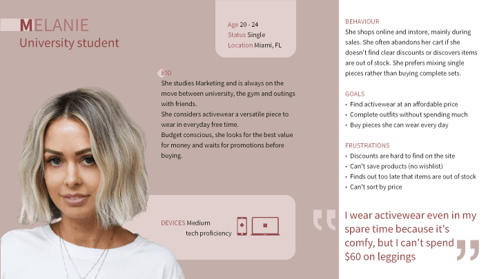
Eco-conscious shopper who still needs to justify $60
Target
54 women aged 20–40, based in the United States.
Method
Quantitative research: questionnaire.
Objectives
Sensitivity to environmental / social impact
Activewear selection criteria and usage contexts
Where and what they purchase most frequently
Data that drove design decisions
53%
Is environmentally conscious
Sustainability is an important value and contributes to trust in the brand.
69%
Shop in store
To try the product and assess the fit.
71%
56%


PERSONAS & USER JOURNEY
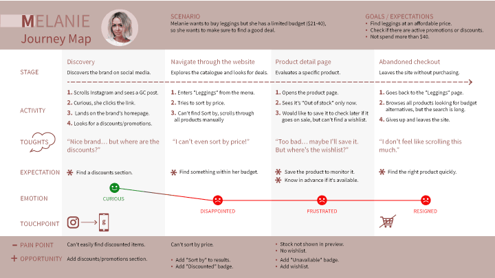
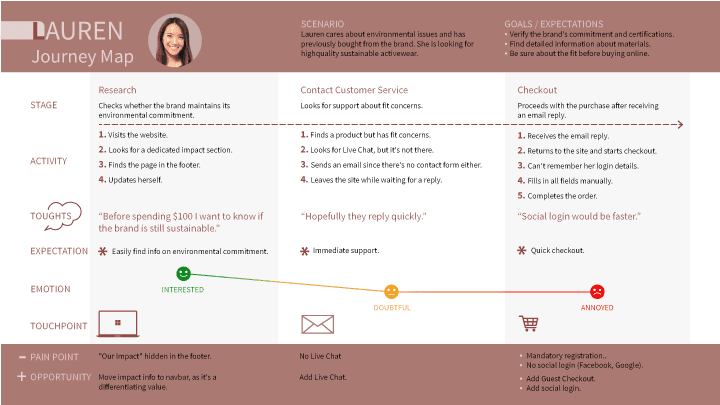
2 Personas data-driven and 2 journeys mapping opportunities for improvement.

INFORMATION ARCHITECTURE
Current state

DESIGN IMPLICATIONS
What blocks the purchase?
The journeys surface some pain points:
Findability & Access
Hidden discounts > users leave the site
No "Sort by" > frustrating browsing
Stock not flagged > wasted clicks on unavailable products
"Impact" buried in the footer > recycled materials are the brand's core
Support & Decision
No Wishlist > impossible to save favourites
No Live Chat > doubts unresolved in real time
Checkout frictions
Mandatory registration > lengthy process
No social login > a brand born from a viral Facebook campaign
Future state

USERFLOWS


WIREFRAMES


USER TESTING
Did the fixes actually fix? Yes. Under a minute on desktop, 10 seconds on mobile
Five weeks of research pointed to three fixes. Time to see if users actually felt the difference.
Target
5 women who participated in the earlier research, aged 25–43.
1. regular online shoppers
2. medium/high device proficiency
Metrics
Task completion time
Average time per screen
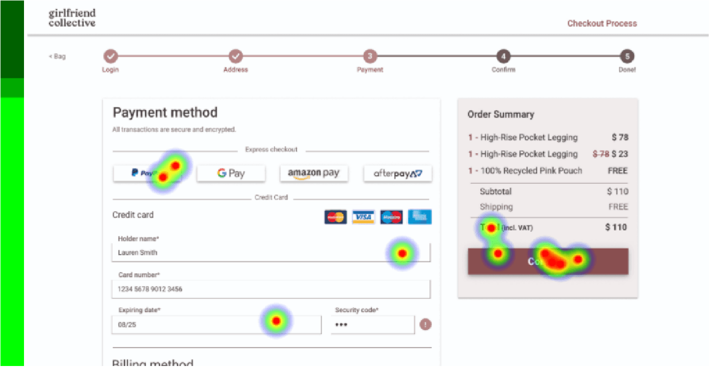
Heatmap
Desktop
Task A - Product Findability
You want to buy a pair of leggings and have a specific model in mind. Browse the website and Add to Bag the following item: "Compressive high rise legging in Plum".


Task B - Checkout
You have already added some products to your Bag and now want to purchase them.
Go to the Bag and complete the checkout via Login.




Mobile
Task C - Finding discounts
You have a limited budget and want to buy a product on sale.
Where would you click to check if any discounts are available on the site?


Task D - Contacting Customer Service
You need to clarify a doubt about a product.
Where would you go to quickly contact Customer Service?


TEST RESULTS
Desktop
Task A - Product findability
Task B - Checkout
Completion time: under 1 minute
Mobile
Task C - Find discounts
Task D - Contacting Customer Service
Completion time: under 12 seconds
Observations
4/5 used the homepage Discounts slider, only 1 used the navbar item
Sliders are more effective4/5 opened "Help & Contact" in the footer, only 1 used the Live Chat
Feature not visible enough, consider making it sticky or adding padding
UI KIT
Inclusivity in sizing and design
Skin tone shades for a UI palette that meets accessibility standards according to WCAG guidelines.