Projects > Case study
eCommerce
/
Data-driven, AI-enhanced checkout and conversational design
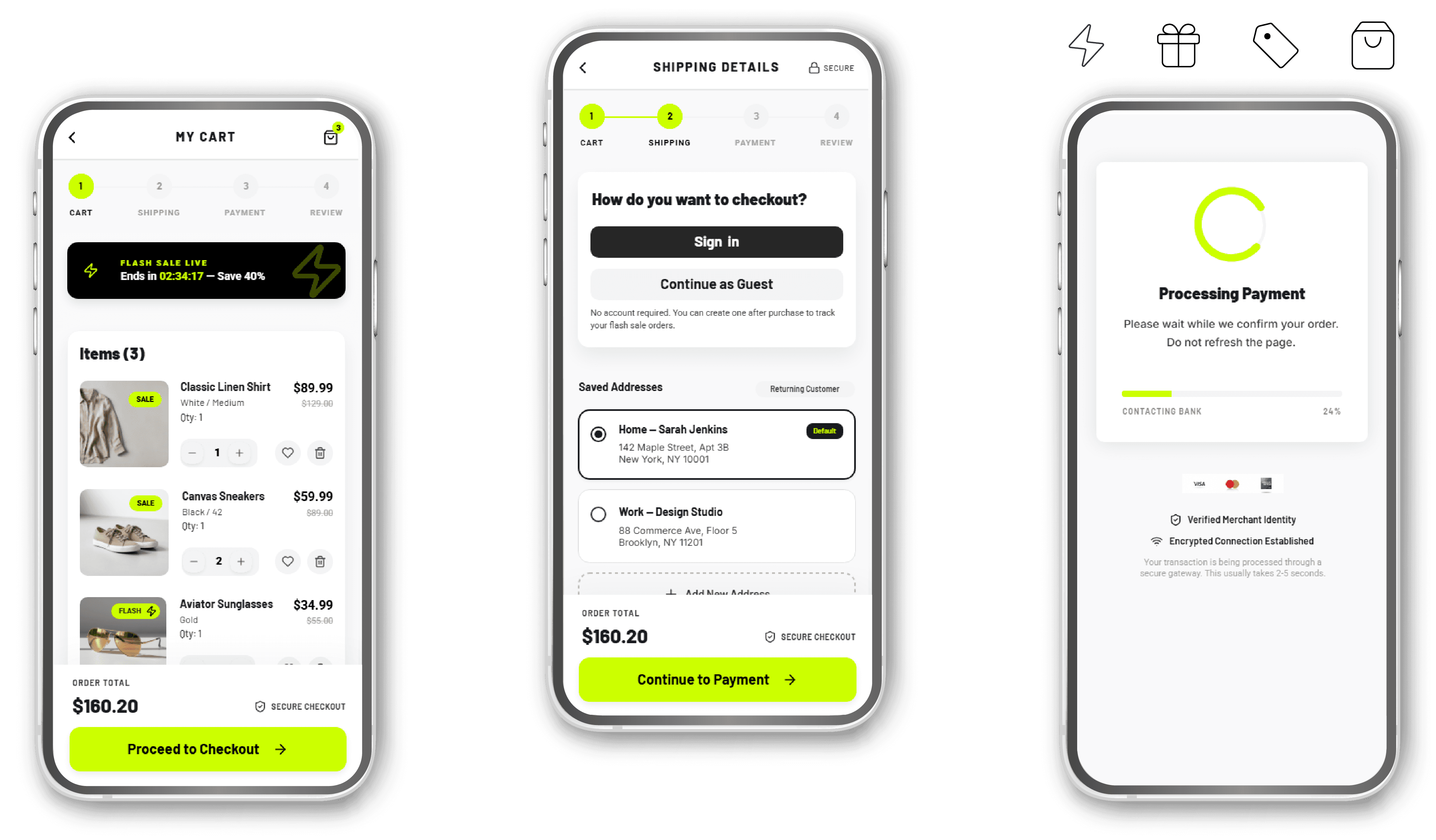
How 50 user feedback items became a stable and reassuring checkout
OVERVIEW
A B2C e-commerce platform preparing to launch a seasonal flash sale, impacted by a high checkout abandonment rate.
Users at the point of purchase, with two contrasting profiles: those seeking transparency and speed without friction, and those needing reassurance.
THE BUSINESS PROBLEM
Surveys, interviews and user stories revealed friction concentrated around payment and order confirmation, but there was no clear framework to determine which issues to address first before the upcoming sale.
CHALLENGE
Design a more flexible, transparent and predictable checkout by turning unstructured qualitative data into actionable priorities before the campaign.
SOLUTION
A checkout redesigned around the 3 priority issues: unclear costs, perceived instability during payment and information overload during order review and confirmation.
The cost is always clear
Discounts, shipping, taxes and the total are visible from the cart to confirmation.
Changes are not destructive
Each section can be edited without losing data or interrupting the funnel.
The transaction status is explicit
System feedback during processing makes what is happening visible and reduces uncertainty.
No upsell that introduces new decisions
Order confirmation is focused on completion and tracking, without promotional distractions.
AI assistant based on measured needs
The 3 high-frequency intents, Coupon, Payment and Tracking, are managed through dedicated conversational flows.
The AI-enhanced design process
AI FRAMEWORK
How I used Generative AI
I analyzed user data first.
I gave AI structured prompts enriched with data + constraints + context + design instructions.
I critically evaluated every output and discarded results not connected to the data.
Why? AI supports both divergence and convergence, but final decisions remain with the designer.
Because I don't want generic, unusable results. I need outputs strictly tied to the rules I set. The more precise the prompt, the more effective the result.
DATA ANALYSIS
50 feedback items, 5 days and a problem concentrated in 3 clusters
I had qualitative data from surveys and interview notes, with a limited deadline to frame the problem and solve it.
I prompted AI to extract patterns and semantically group user feedback into categories, which I assigned frequency and severity.
High frequency + high severity = priority
8 pain point clusters emerged, but only 3 met both criteria.
Based on this, I built the hierarchy:
Payment and form stability - Frequency 11 | High severity
Taxes, discounts and price transparency - Frequency 10 | High severity
Order review and confirmation - Frequency 9 | High severity

PERSONAS
Archetypes built on patterns emerged from the research
David Miller "Hesitant guest"
I just want to buy this one item quickly. If you force me to create an account or hit me with surprise shipping costs at the very end, I'm closing the tab.
Sarah Jenkins "Anxious planner"
When the screen freezes after I click "Submit Payment", I panic. Did I get charged twice? Did the order go through? I need constant reassurance.


CUSTOMER JOURNEY
Mapping journeys and touchpoints to define product features
David and Sarah encounter friction at the same checkout moments: payment, review and confirmation.
The journeys highlighted that the interface doesn't clearly communicate costs, transaction status and the possibility of editing entered data.


FEATURE PRIORITIZATION
How I turned the emerging opportunities into actionable features
I translated the critical points from the customer journeys into features, prioritizing them based on:
User impact, measured by cluster frequency and severity
Technical feasibility.

30 user stories, translated into prototypes and connected into flows

WIREFRAMING
Aligning the design with user needs
At this point, each screen had a precise function in reducing purchase uncertainty.
I built a prompt to generate 6 wireframes aligned with the user stories, including modules, buttons, microcopy and interaction logic.
I then verified that each deliverable was connected to one or more user stories, keeping each UX element anchored to the data.


UI REFINE & PROTOTYPING
From wireframe to hi-fi prototype in 10 minutes
With AI, I accelerated the optimization of the checkout: positioning, readability, spacing of elements and generated the interactions.
Optimized positioning, spacing and accessibility
I introduced an accent color, with contrast compliant with WCAG standards, to strengthen the brand identity and create a consistent visual signal for interactive elements and priority financial information.
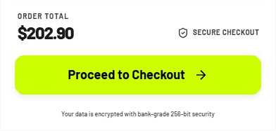
A sticky bottom bar keeps the current total and main CTA always visible and anticipates the next step.
Interactive elements meet a 44×44 pt touch target.
Improved readability and information hierarchy
I defined a typographic scale: Barlow for headlines and CTAs, Roboto for body text, microcopy, links, forms and help text.
I made required fields explicit through an asterisk (*) and helper text, and introduced actionable error messages, avoiding generic feedback.



CONVERSATIONAL UI
A conversational assistant that recognizes user intent
I designed and tested an AI assistant that recognizes user intent and activates a dedicated path for the 3 key checkout scenarios:
Use a coupon (green flow)
Make a payment (blue flow)
Track an order (pink flow)
Starting point:
Hi! I’m your checkout assistant. I can help you with promotional codes, payment issues, or tracking your order. What do you need help with?
Waits for user input.

Scenario 1
Use a coupon
The flow recognizes keywords and synonyms and guides the user through applying the code, handling both outcomes:
Valid: confirms the discount applied and updates the total.
Invalid: suggests trying again or continuing at the current price.

Test with valid code

Test with invalid code

Scenario 2
Make a payment
The flow recognizes the payment-related intent and offers alternatives in case of friction.
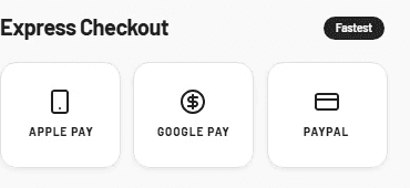
Express Checkout: Apple Pay, Google Pay or PayPal.
Retry with card: redirects to the secure payment system.

Test for checkout express

Test for debit card

Scenario 3
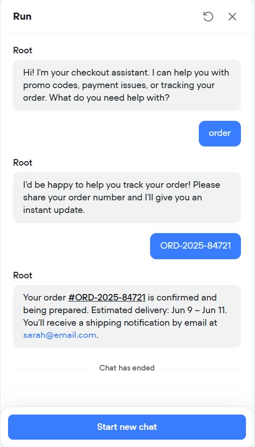
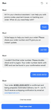
Track an order
The flow recognizes the intent and guides the user through retrieving the shipping status.
The assistant requests and validates the order number:
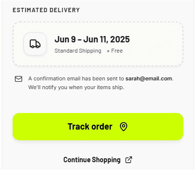
Valid: confirms status, delivery date and email notifications.
Invalid: reports the error and allows the user to try again.

Test with valid order number
Test with invalid order number
FINAL CONSIDERATIONS
Where, how and when I use AI
I integrate generative AI in the UX and UI phases: user research and competitor analysis, personas and user journeys, feature prioritization, wireframing and prototyping.
With a method developed through a specialization in "Generative AI for UX/UI Design", a certificate in "Prompt Engineering" and the related IBM digital credentials.
I analyze data before prompting.
I conduct my research, identify competitors and users, and study the available information.
This allows me to critically evaluate what AI produces: recognize results that are not connected to the data provided and decide what to include, discard or explore further.
The tricky part is creating an effective prompt.
Based on the objective and the design phase, I use prompt engineering to diverge, exploring alternatives, and converge on the most relevant directions.
I apply different prompting techniques enriched with contextual data to obtain relevant results and reduce the risk of "AI hallucinations”.