Projects > Case study

Bank***

/

/

Geolocation as a touchpoint for accessing financial services

/

Geolocation as a touchpoint for accessing financial services

Connecting with a financial advisor in one click

OVERVIEW

Leading italian financial company specializing in wealth planning and management needed a touchpoint to enable direct contact between potential clients and financial advisors.

> Target:
> Target

consumers looking for a financial advisor.

Consumers looking for a financial advisor.

THE BUSINESS PROBLEM

There was friction in client acquisition and overload for support staff. Users had no way to identify an advisor on the territory: they had to visit a branch, contact customer service for a list of names, or search on Google Maps, where competitors also appeared.

CHALLENGE

Implement a locator for independent advisor search.

Dedicated UX research budget to understand which filters and information people actually needed to choose.

ROLE

Product Designer (UX/UI)

RESPONSIBILITY

UX Research, Competitor Analysis, User Journey, User Flow, Information Architecture, Wireframe, Prototyping, Design System, Developer Handoff

TEAM

1 Project Manager, 2 Developers

TIMELINE

6 weeks

ROLE

Product Designer (UX/UI)

RESPONSIBILITY

UX Research, Competitor Analysis, User Journey, User Flow, Information Architecture, Wireframe, Prototyping, Design System, Developer Handoff

TEAM

1 Project Manager, 2 Developers

TIMELINE

6 weeks

SOLUTION & RESULT

Locator integrated into the company site: find and contact the nearest financial advisor in one click.


Research surfaced two needs:

  1. Logistical filters (parking, nearby services).
    Excluded as Google Maps already handles these better.

  2. Trust information (photos, expertise, advisor reviews).

Feature "Search advisors"

Feature "Search advisors"

Added as a direct entry point in the main navigation, avoiding searches on Maps where competitors also appear.

Users retained on the site

Potential clients complete the search within the platform, with integrated "Street View". Google Maps only comes in for "Directions", once an advisor is chosen.

-35% in customer service requests

-35% in requests

Reduction in calls and contacts regarding advisors in the territory over 6 months.

The design process

COMPETITIVE ANALYSIS: DIRECT, INDIRECT AND COMPARABLE

13 competitors benchmarked with a dedicated UX research budget

Analysis method
  • Feature Inventory: comparison of features and filters (direct and indirect competitors)

  • CTA and click-through: Entry points and number of clicks to reach the locator (direct competitors)

  • Task Analysis: Advisor search flow (direct competitors)

Additional exploration

I also looked into UI interface, lead generation through the locator, and Google Maps best practices for an effective locator.

Key findings from the analysis

1 click on desktop, 2 on mobile

To reach the locator.
Against solutions requiring 6+ clicks, doubling on mobile.

Advisor profile card

Few show expertise or background.
Contact happens without context.
A gap confirmed by user research.

Full-width map

Some adopt a full-width map with a collapsible results list, improving mobile usability.
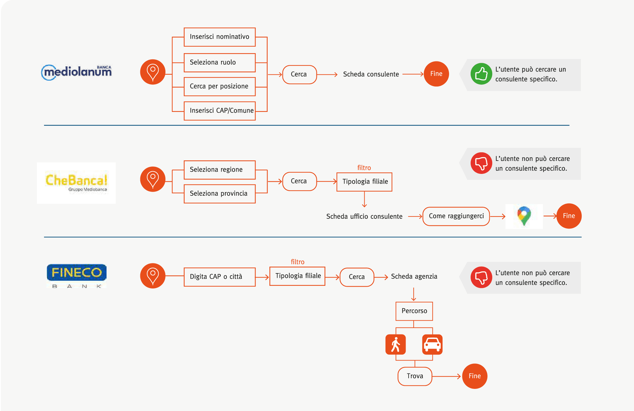
Is the locator perceived as a way to connect with an advisor?


No, in most cases it remains a list of branch locations or generic contacts, not a direct access point to the professional. Two patterns emerged:
Fast access 1-2 clicks

Locator shows only branch locations with generic “pin” icon or “contacts” label.

Long access 6+ clicks

No dedicated locator, only long lists of names under a “contact advisor” menu item.

Is the locator perceived as a way to connect with an advisor?


No, in most cases it remains a list of branch locations or generic contacts, not a direct access point to the professional. Two patterns emerged:
Fast access 1-2 clicks

Locator shows only branch locations with generic “pin” icon or “contacts” label.

Long access 6+ clicks

No dedicated locator, only long lists of names under a “contact advisor” menu item.

USER RESEARCH

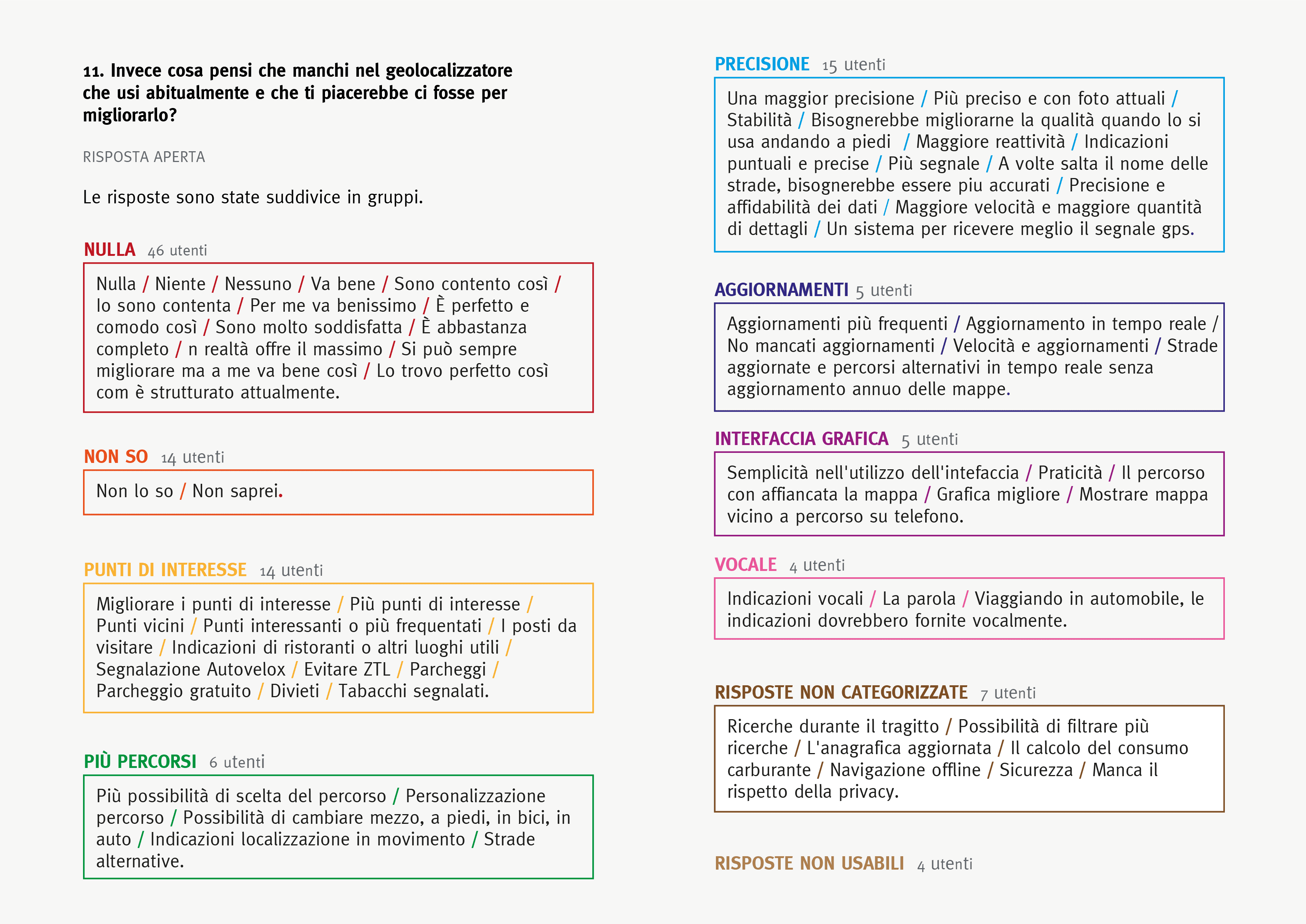
How do you search for and choose a financial advisor?

Starting from the target already profiled by the client, I used UX research to investigate how people begin their search, the criteria that influence the choice and what information they consider important before contacting an advisor.

Premium Target

120 Italian users aged 35-70 with income from €22k, who invest through an advisor in funds, bonds, pension plans and ETFs.

Quantitative research

A questionnaire combining screening questions with multiple-choice and open-ended questions.

Key insights from the research

25%

Start research with the locator.
75% rely on mediated channels: their bank or word of mouth.

I ask my bank or someone I know first

58%

Doubt about the advisor's reliability is the main barrier.
Trust as the essential factor.

I need to trust them before handing over my money

72%

Prefer reading a profile card.
Skills and specializations are decisive.

I want to know their expertise and the feedback they've received

74%

Use Google Maps even when the site has an integrated locator.
Considered the standard.

I always use Google Maps, if it's complicated I give up

88%

Find photos of location essential.
Images aid orientation.

Images help me not get lost when I arrive

TARGET PROFILE

People aren't looking for the closest pin, but for someone they could trust

Proximity is not the guiding factor: before contacting a professional, users want to reduce uncertainty through credibility and context.

Project priorities were: advisor profile, reviews, location photos.

USER RESEARCH

How do you search for and choose a financial advisor?

Starting from the target already profiled by the client, I wanted to understand how the search begins, which criteria guide the choice and how people expect to interact with a locator, mapping the devices most used.

Premium Target

Italian users aged 35-70 with income from €22k, who invest through an advisor in funds, bonds, pension plans and ETFs.

Quantitative research

Questionnaire combining screening questions with multiple-choice and open-ended questions submitted to 120 users.

Key insights from the research
⭐️

Connect to Content

Add layers or components to make infinite auto-playing slideshows.

CONSTRAINTS & DESIGN DECISIONS

What make sense to build and maintain over time?

UX research had validated three levers for building trust in the advisor.

During delivery, technical reality imposed other priorities: I had to redesign the solution, shifting the focus to establishing contact faster.

UX research had validated 3 levers for building trust in the advisor.

During delivery, technical reality imposed different priorities: I had to redesign the solution, no longer to inform more, but to connect faster.

Hypotheses

validated by UX research
  • Route on map and points of interest (planning)

  • Advisor profile cards (decision support)

  • Reviews (trust)

Constraints

emerged during delivery
  • Large advisor network without structured data

  • Lack of homogeneous content for cards and reviews

  • Limited resources for implementation and maintenance

Implications

for design
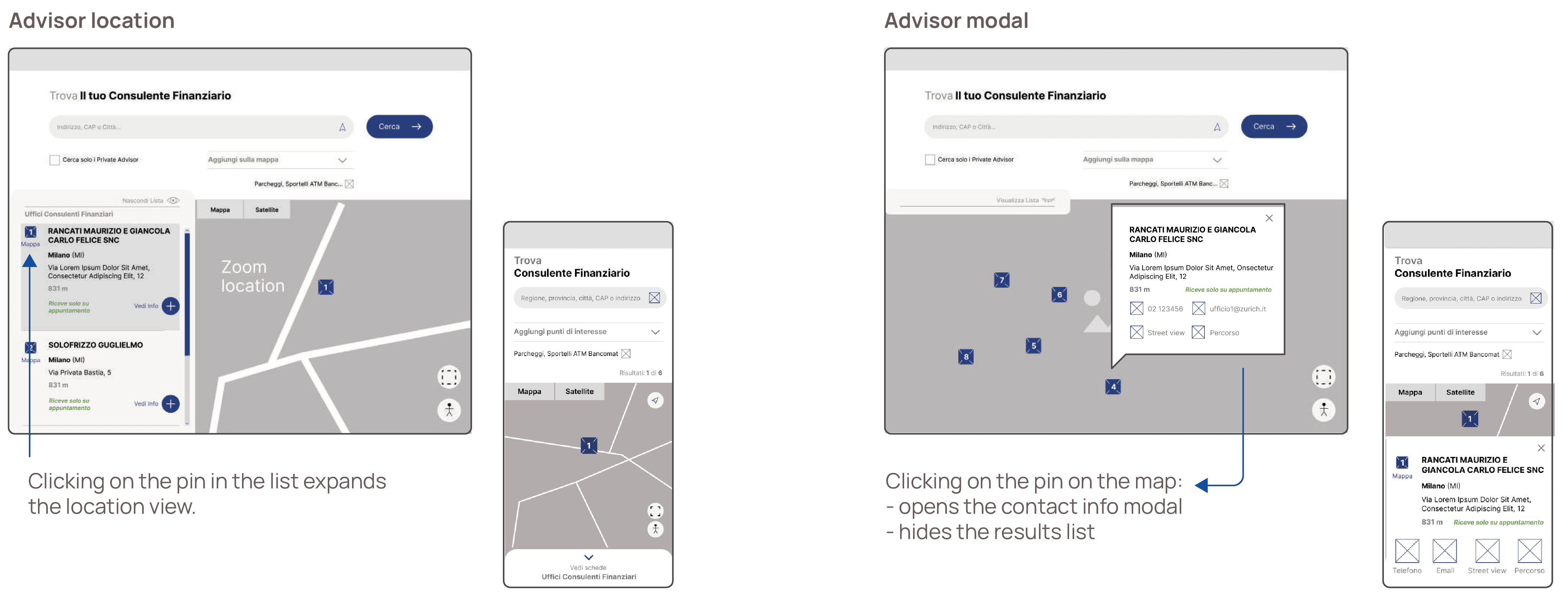
  • Removal of filters, consultant cards and reviews

  • Focus on quick access to contact and location

  • Scalable solution aligned with feasability

WIREFRAMES

DESIGN SYSTEM

New components for the existing system

New components for the existing system

I extended the existing design system with new components, designed to scale across other touchpoints:

  • Full-width map

  • Dedicated buttons and icons

  • Collapsible results list with closed/expanded states

  • Responsive contacts modal

FUTURE ITERATIONS

Today find and contact, tomorrow know and evaluate to choose

Research showed that profile cards, reviews and photos could increase trust in the choice.
Excluded from the first release because advisor network data wasn't yet structured and consistent enough.
The next iteration can build on top of this foundation.


In the meantime the locator reduced inquiry requests regarding local advisors by 35% in the 6 months after the launch.

Create a free website with Framer, the website builder loved by startups, designers and agencies.